December 1, 2010.
This is no longer the newest version, version 3.0 is the newest.
Note. If you are using a version before 2.2, please look at the release notes for 2.2, since the update 2.1.1->2.2 was a significant update.
The biggest improvements are: find and replace, improved paste/import and label formatters.
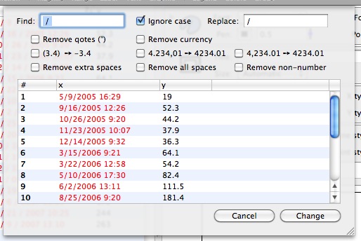
Find and Replace:
Sheet to to search and replace. Select a sub-set of rows or columns or search the entire table. Preview the search, combine search-replace actions and then apply the changes. This reduces the need to take the data to a text editor to do simple transformations.
Improved Paste/Import:
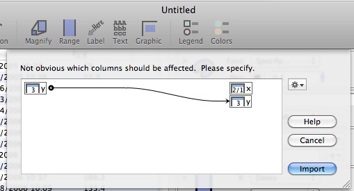
Before when pasting in rows or importing data over rows, the content would be added to the columns visible at that time. This meant that if you had hidden a column or group of columns, this data was not modified. It also meant that if you wanted to paste into a column that wasn’t visible, you had to show it, then paste, then hide it again. This had been addressed before in the context of removing rows (selecting rows and hitting delete) and in 2.3 the same mechanism is used to decide what happens when you paste in data. This also allows you to paste in data even if the number of columns in the table doesn’t match the number of columns in the clipboard/input file.
netCDF file import:
In addition to text, Cricket Graph and matlab data files, DataGraph now understands netCDF files. All vectors in a netCDF file are imported into columns.
Label formatters:
When you put a numerical value in a token field, the token menu now allows you to set the format, not only switch where the label is coming from. Note that the menu will show you how the current value will be displayed. This works for dates
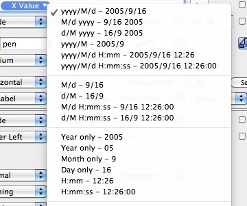
as well as numbers.
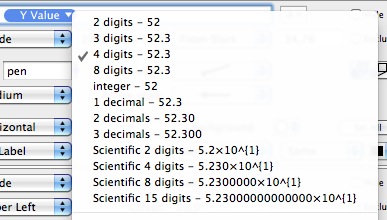
This format can be used in the column expression
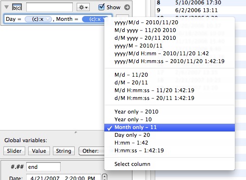
Can also use formatters for labels in Point, Plot etc. Depends on if the column is a date or a number column. This allows you more control over labels, and you don’t have to adjust how the column is displayed in the table. Can also specify strings to append/prepend to each label.

This also applies to labels for labels for a bar graph

Improved Label command:
The label command was improved quite a bit.
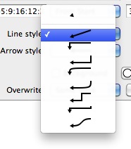
There are now now more line styles for the arrow (9 instead of 3), including an “empty”, and various smooth options.
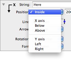
There are also more options where the arrow is positioned. The default is still inside the graph area, but you can also tie it to x/y axis.
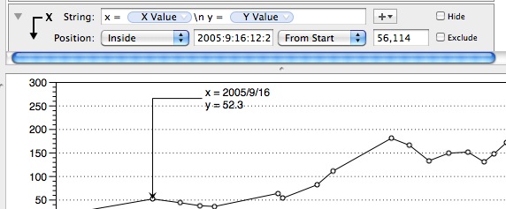
You can display the x and y values as well, and with the improved number formatters, the “X String”/“Y String” options should not be needed, and might be removed in a future version.

Multiple lines:
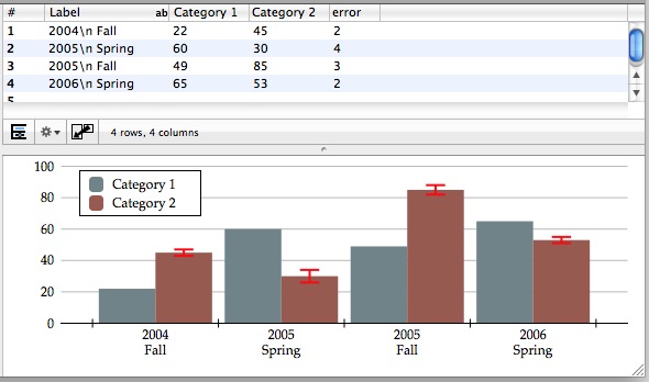
Before, the only way to create multi-line text blocks was to use the Text command. Now, added better support for multi-line text that is either pasted in (with linefeeds) or that uses the \n command. So “First\n second” will put “second” in the second line. This works throughout, axis labels, labels, point labels, etc.
And in axis labels
Dynamic icons:
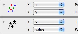
The icon for the Plot and Points command reflects the drawing style. This makes it much easier to tell which command draws what.
Other useful additions/changes are:
- Added a “Copy as Text” option to the Edit menu. Works only for a table selection. Copies exactly what is displayed in the table.
- Added a "Does not match" option to the mask.

- Changed the legend command. Now all entries that have the same legend name are overlapped. Before it was much more restrictive, and the legend name + data had to agree. Now only the legend name has to be the same, and all entries will be overlapped.
- For a date axis - Automatic, I added a check box so that you can force the axis to only be a single line.
- Added a small arrow to the column definition entry if the column is displayed in the table. Click on the icon to select the column in the table. Intended to make it easier to see where the column is when you have a lot of columns in a table.

- Can use a mask in the Plot command
- More label positions for bar graphs.
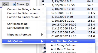
- Added a menu entry for the column gear menu to add columns right after the current one. Before, it would get added to the end.
- Can now select to draw a text block above the current graph (Text command).
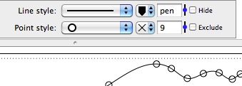
- For markers, can now select “No Color”
- Can copy information from a histogram command. Can for example paste the histogram columns into a data table and fit them to get a distribution function.

- For the string column, added the natural sort option. This puts file3 before file23. Select this through the gear menu (context menu).
- When you convert a number/string column to a date column, DataGraph will try to suggest the date format. That should reduce the number of clicks needed, and you can still use the context menu for the date column to see what other date formats work.